 6
comments
|
Thursday, October 26, 2006
6
comments
|
Thursday, October 26, 2006
The dawn of Web 2.0 saw a rise of graphical rethinking of how users use and see web pages.
From, what is now called "Web 1.0", Web 2.0 is more interactive, colors are more in tune and everything looks and feels more responsive, a synergy of design and functionality.
Flash, AJAX, Ruby and countless other web technologies that have spawned the birth of the New Web are now showing us something very interesting.
They are showing us how it is possible to manage and display data that would otherwise overwhelm us, or at least they show data in more manageable way.
With this said, we still have to address some issues in that design should lead the functionality but not if it impairs the functionality itself. No mater how nice the design is its function is not properly implemented.
Listed below are some interesting examples (not all) of what the ways data is presented on the Web today.
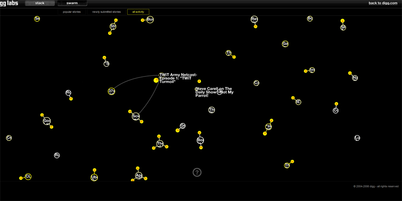
Digg Swarm
Digg needs no introduction, but it is a prime example of Web 2.0, user driven content website. Digg Swarm is currently just a part of Digg Lab. It is a first example of mismatch between design and function. It is nice, but just nice as it is plague by problems in the functionality. Design is very well made but Diggs popup to fast and fade to fast for anyone to follow. If there was just a list on left side with currently displaying stories it would increase the look and feel dramatically.
MappedUp
MappedUp together with Digg Swarm, is another example of News generated content. It has somewhat different approach than Digg Swarm. It does now show all of news at once but shows only the "hot" news. The problem here is that it is to slow, and some what to awkward to set up the feeds.

AmazoNode
This is an excellent example of how mapping tech can help up go trough massive amount of data from user generated content. It looks good and functions good. Amazonode shows relations between books and if you are into books this is a site for you to visit.

MusicMap
MusicMap does basically the same thing as AmazoNode but is more sophisticated in design and only searches music. An EXCELLENT example of design and functionality, its a shame the depth of information is limited.

LivePlasma
LivePlasma and MusicMap are one and the same but different. LivePlasma has more in depth information but its design and functionality is somewhat limited and harder to manipulate then MusicMap.

Breathing Earth
Breathing Earth is an interesting concept. It only function is to show current state of the Earth. Some shown data are CO2 emissions, birth and death rates. It is updated in "real time" but most probably it uses historical statistical methods.

Havaria
Havaria also an interesting concept. Well, its more then concept. It is exceptionally up to date map of disasters or potential disasters around the world. This site is an example where functionality takes a sidestep from design.
This site would benefit a lot from design overhaul.

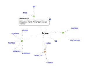
WordNet
There are a lot of dictionaries out there but this one is different. WordNet uses connections to show relations between words.
MusicLens
MusicLens is another approach to music search. It enables a user to specify the preference in music and it will show the list of possible matches. It is also possible to listen to part of presented music.

This is just a part of interesting thing happening now in the way we see data.
We live in interesting times.
Labels: Music, Visualisation

6 Comments:
so u started an interesting blog my firend. can wait to see more.
peace out
8:48 AM
What can I say, I will never be bored at work again!
9:27 AM
ncc...
getting better everyday :P
12:06 PM
Jo NCC...
we need to fasten up your posting on this blog OK..is this warp or impluse speed..c'mon hunger for new things is almost unbearable..
peace
3:43 PM
One a day, one a day
Unless U wish to contribute?
10:32 PM
well maybe one day....
right now i'm busy
what will future bring we will see
5:08 PM
Post a Comment
<< Home